About
Background
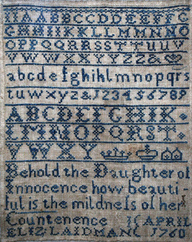
Some may know her as a famous iconographer, creator of graphical user interfaces, or “the woman who gave the Mac a smile”. Others may not have even heard her name, but they've probably seen her work. However, not even she could've guessed what she would create. Susan Kare was born on February 5th, 1954 in Ithaca, New York, but she grew up in the suburbs of Philadelphia. From a young age, she was always interested in fine art, and her mother taught her things like needlepoint and cross-stitch. During the summers while she was in high school, she interned for Harry Loucks at the Franklin Institute. Here, she was first introduced to typography and graphic design and learned phototypesetting.
She then graduated with a Bachelor's Degree in art at Mount Holyoke College in 1975, a private liberal arts women's college in South Hadley, Massachusetts. Here, she completed an honors thesis on sculpture, and also took pro-bono jobs to gain experience and build her portfolio. She then went on to complete a Masters and PhD in fine arts at New York University in 1978, and wrote her doctoral dissertation on “the use of caricature in selected sculptures of Honoré Daumier and Claes Oldenburg”. She had always imagined she would be a fine artist or a teacher, and so after graduating, she moved to San Francisco to follow that dream. Her first job was working at the Fine Arts Museums of San Francisco as a sculptor and museum curator. However, her career path would take a turn when an old high school friend called her one day.
The Apple Era
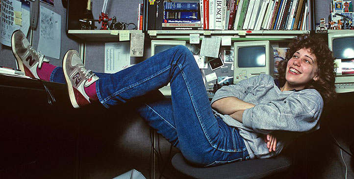
She was working on a commissioned sculpture in 1982 when Andy Hertzfeld called her and asked if she could design a few icons and font elements in exchange for an Apple II computer. She made a few sketches of icon ideas on graph paper, and was offered an interview for Apple, which lasted all of about 5 minutes, and according to Kare, it was “when can you start”. She was officially hired in January of 1983 to work on the Mac, and over the next few years she revolutionized (and basically invented) graphical interface design.
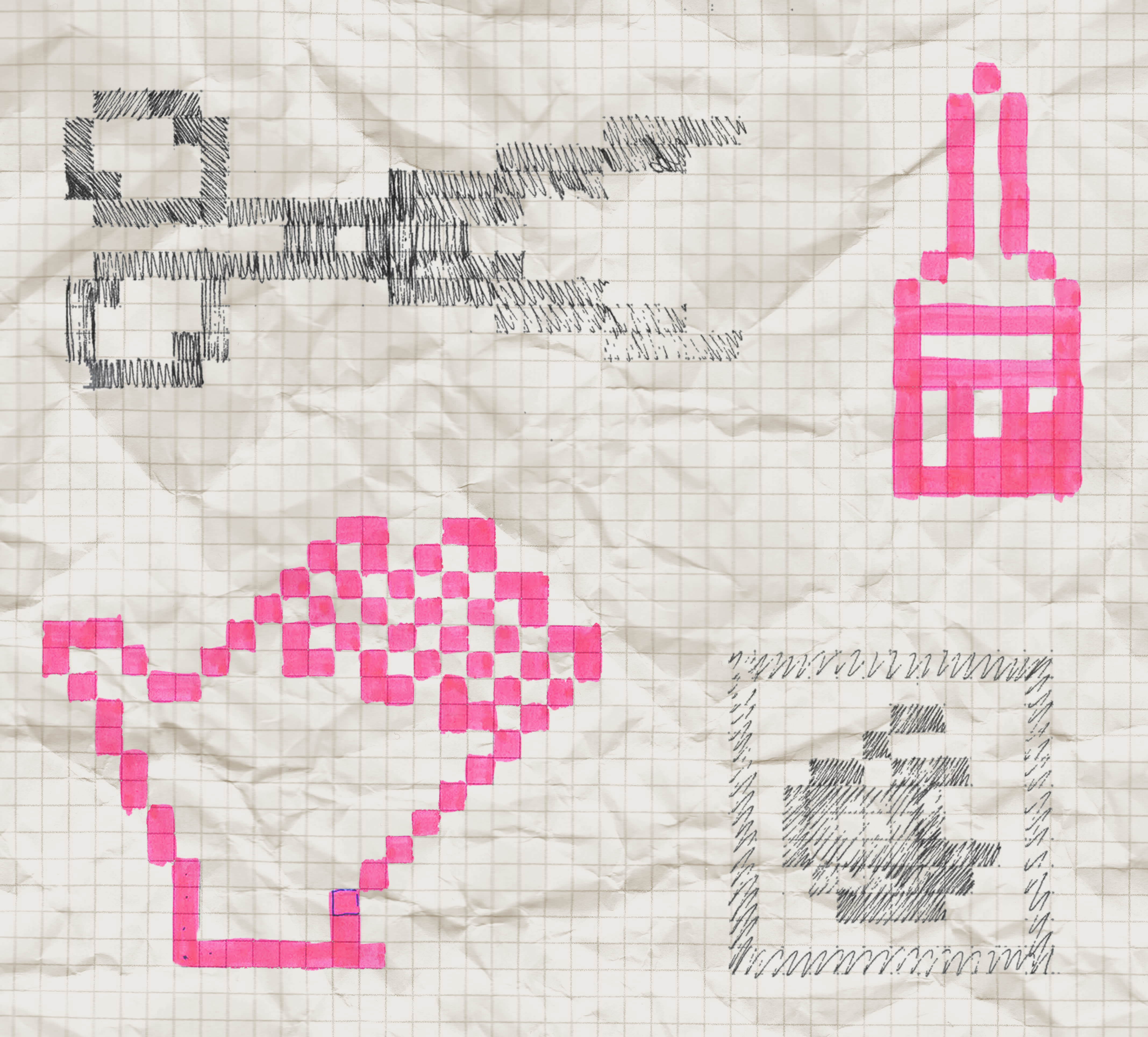
She took inspiration from needlepointing and cross-stitch to create bitmap icons for different buttons on the computer. She said, “If you ever study art history you know nothing really is new — And people have certainly communicated with little pictures for a while … and told stories with symbols.” She always used metaphors in her iconography such as scissors for “cut” or the iconic floppy disk which even today still means “save”, and “tried not to use words, and not to use puns, because they don't translate.” In fact, most of the icons she created for the original Mac can still be seen in modern computer programs such as Word and Photoshop.
She also came up with more abstract icons when nothing else seemed to work, such as the command key icon. Originally they had used the apple icon, but when Steve Jobs complained about there being “too many apples on the screen”, Kare was tasked with making a new icon. For this, she found inspiration in a symbol dictionary with a Swedish campground symbol for “feature” — the command key icon we still know today. In an interview, she said, “I like to think that good icons are instantly recognizable — even if someone's never seen it, you can ask them what it does, and they get it — or it's so easy to remember that if someone tells you what it is once, it's easy to remember when you look at it. I think that's a lot to ask of a symbol, that if you tested it everyone would all have the same one-word response as its function.”

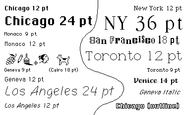
She also created the Mac's main system fonts including Chicago (which was used in menu bars and later on the iPod), Geneva, and Monaco. For Susan, creating these icons in a 16 or 32 pixel wide grid was like a puzzle. They needed to be recognizable and memorable so that users would know what they did, and they could easily interact with the device. However, the technical limitations meant that she couldn't make anything too precise or complex. In fact, regardless of medium, Kare believes that good icons involve using “just enough detail”.
Growing With Technology
In the three decades after leaving Apple and NeXT, she was a freelance designer. She claims to have created “thousands of icons for hundreds of companies”. She initially made many icons and elements for tech giants at the time. For Windows 3.0, she made solitaire cards, wallpapers, icons and design elements. She also made icons for IBM's OS/2, and created bitmap illustrations for General Magic's personal digital assistant. Facebook also hired her to create 64 by 64 pixel icons for digital gifts which could be sent. Finally in 2015, she left freelancing and was hired by Pinterest as product design lead.
As technology improved, Kare began to experiment with color, although it was quite limited. Windows 3.0 only had 16 colors. However, Kare used this to its fullest. By dithering colors (arranging them in a checkerboard or grid-like pattern), she could trick the eye into seeing more than just those colors. This is even more convincing with the CRT monitors of the time, as they naturally blurred and blended the pixels.
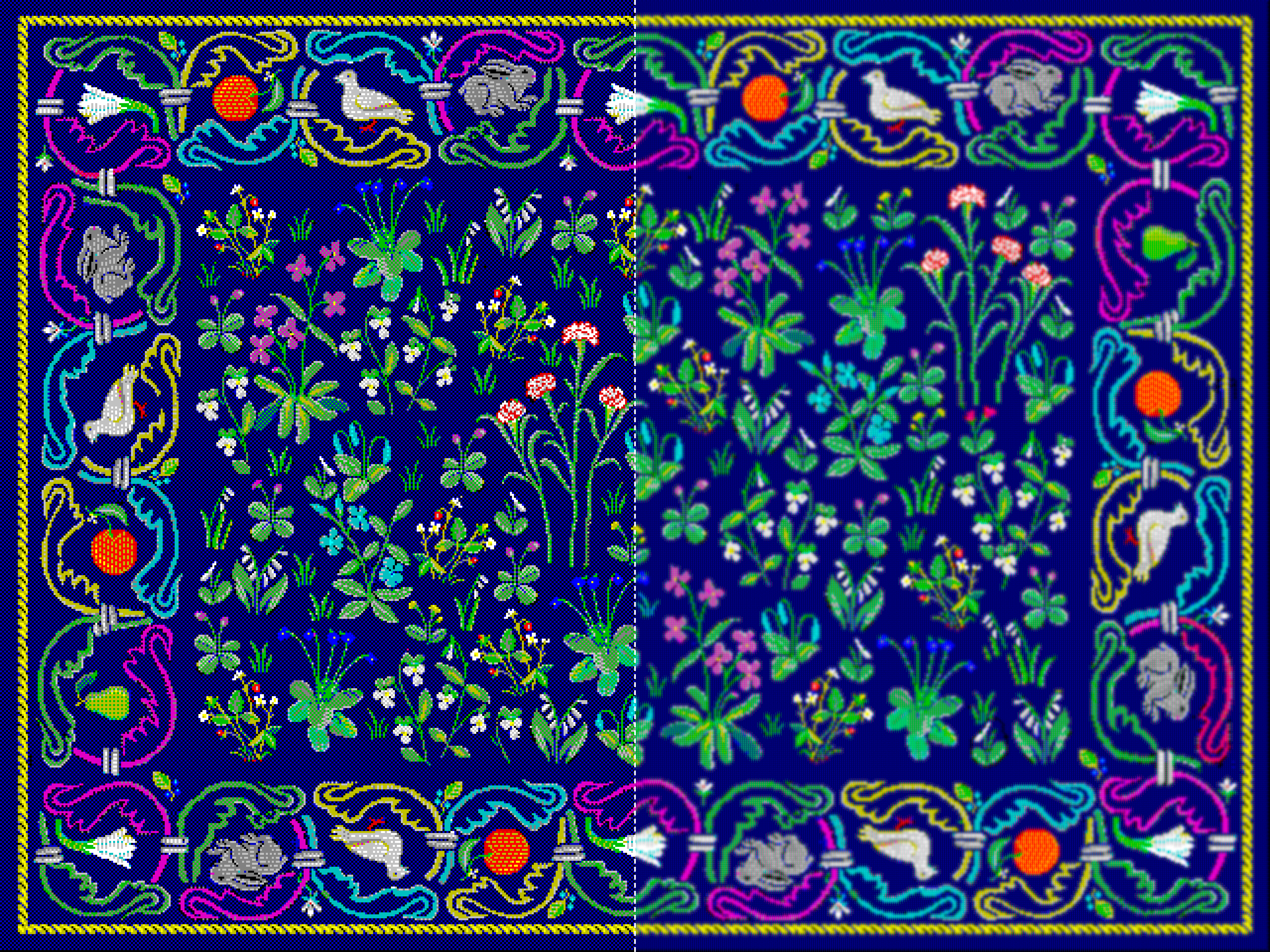
With the advancement of technology also came the ability to include more color. Kare started out designing in black and white for the Mac. When she worked on Windows, a whole world of color was introduced, even though there were only 16 to work with. As computer capabilities improved, they were soon able to support more colors. Computers still had default colors for icons and menus, but 6-level RGB went on to define web-safe colors. This created a set of 216 colors which could be safely used on any computer without any dithering effects. These would likely be what Kare used to create her Facebook gift icons. Now though, we have reliable access to the over 16 million colors created by 256 levels of red, green, and blue. Kare has also gone on to design physical products like stickers and pins, which come with their own color spaces and restrictions, such as CMYK for printers, or even using custom inks to get an exact color.


The Pioneer
Currently, Susan Kare sells signed prints of her work, and is a design architect at Niantic Labs, which makes AR games and experiences. Although she may not be “the pioneer” of designing for AR like she was for digital interfaces, she is still on the cutting edge of what design can be. Even though her career isn't even over, she's made an enormous impact on the digital design world. Before she came to Apple, computers were unintuitive machines full of wordy buttons. Kare revolutionized and essentially established graphical user interfaces. She came up with metaphors which bridged the gap between the digital and physical world, and created icons which are still seen today.

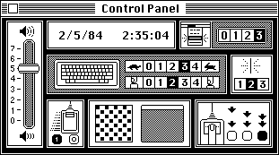
Moreover, her designs were universal. She helped create a control panel for the Mac which had no text at all, and could be understood regardless of language, and allowed anyone to be able to understand the new and exciting digital world. She was the pioneer of digital interface design, and created the foundations for future products. There will always be new design innovations and discoveries, but without working upon the knowledge and frameworks of previous inventors and designers such as Susan Kare, we would never be able to get there.